B2B PLATFORM・PENSION OPERATIONS

Turning pension administration
into a system of action.

From information overload to operational clarity.

An employer-facing pension operations platform bringing employee information, contributions, exceptions, and deadlines into a connected operational experience.

As the Product Designer, I shaped the product experience and later explored a conceptual redesign focused on prioritization, guided resolution, and contextual AI support.
CLEAR PRIORITIES
CONNECTED WORKFLOWS
CONTEXTUAL AI

Project Team:
・Business Analyst
・QA Lead
・R&D Manager
・COO
・Developers

NDA: Interfaces adapted for client confidentiality.

THE CHALLENGE

The information was there.
The next action wasn’t always clear.

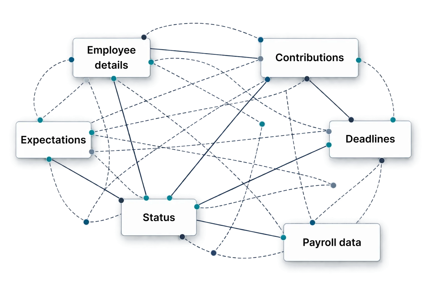
HR and payroll teams manage interconnected employee data, contributions, exceptions and deadlines. But priorities, blockers and next actions were not clearly connected.

Conceptual map of six interconnected pension data points — Employee details, Contributions, Expectations, Deadlines, Status and Payroll data — linked by a dense web of solid and dashed lines, showing how information was connected but the next action was unclear.
THREE WORKFLOW FRICTIONS
01

Unclear priorities

What needs attention first?
02

Fragmented context

What is blocking progress?
03

Unclear next steps

What moves this case forward?

How might we help teams recognize what matters, understand why, and confidently move each case toward resolution?

RESEARCH & INSIGHTS

The real friction wasn’t in a single screen. It was between tasks.

To understand where pension operations become difficult to manage, I analyzed existing product research, reviewed operational interfaces, mapped end-to-end workflows, and examined relevant enterprise platforms. Three patterns emerged:

01

Different roles, different needs

HR and Payroll needed employee-level detail; Finance focused on discrepancies; managers needed an operational overview.

Finance users need exception and reconciliation visibility.
HR managers need an organizational overview before entering individual records.
Payroll and HR operations users need detailed employee-level information.
02

Progress was hard to interpret

Understanding the state of a process often required checking individual records.

The system does not clearly communicate what has already been completed.
Users struggle to understand whether a process is complete, pending or blocked.
Open actions are not visible at the right level of context.
03

Resolution depended on context

Action required connecting the cause, blockers, ownership and the next step.
Urgent and non-urgent issues are not clearly differentiated.
Contribution issues may only become visible during detailed monthly review.
Exceptions are difficult to distinguish from general operational information.

Key insight: Connect information, decisions and actions into one continuous workflow.

THE KEY INSIGHT

Three questions became the product’s design principle.

Rather than hide enterprise complexity, organize the experience around user decisions.

01

What requires attention?

Surface the cases, risks and deadlines that matter most.

02

Why does it matter?

Connect each issue to its context, blockers and potential impact.

03

What should I do next?

Make the next action clear, actionable and accountable.

From displaying information to enabling confident action.

PRODUCT DIRECTION

From a system of record to a system of action.

The research pointed to a shift in how the platform should support daily operations: from organizing pension information to helping users act on it.

SYSTEM OF RECORD
Data
Forms
Reports
Documents
SYSTEM OF ACTION
01

Priorities

02

Cases

03

Blockers

04

Next Action

05

Resolution

Prioritize actionable work
Keep context connected
Design for resolution,
not just monitoring

A case-driven operational experience that connects issue identification to resolution, while maintaining clarity and control.

INFORMATION ARCHITECTURE & CORE FLOW

One connected journey from identifying an issue to resolving it.

Rather than treating dashboards, employee records, and forms as separate experiences, I structured the core workflow around the progression of a case.

Primary case journey

01 / SPOT

Overview

Identify risks and priority work.
02 / SELECT

Cases

Filter and select the right case.
03 / EMPLOYEE CASE

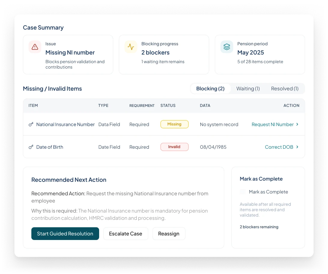
Case Workspace

See blockers, owner and next action.
04 / RESOLVE

Guided Resolution

Review → collect → validate → confirm.
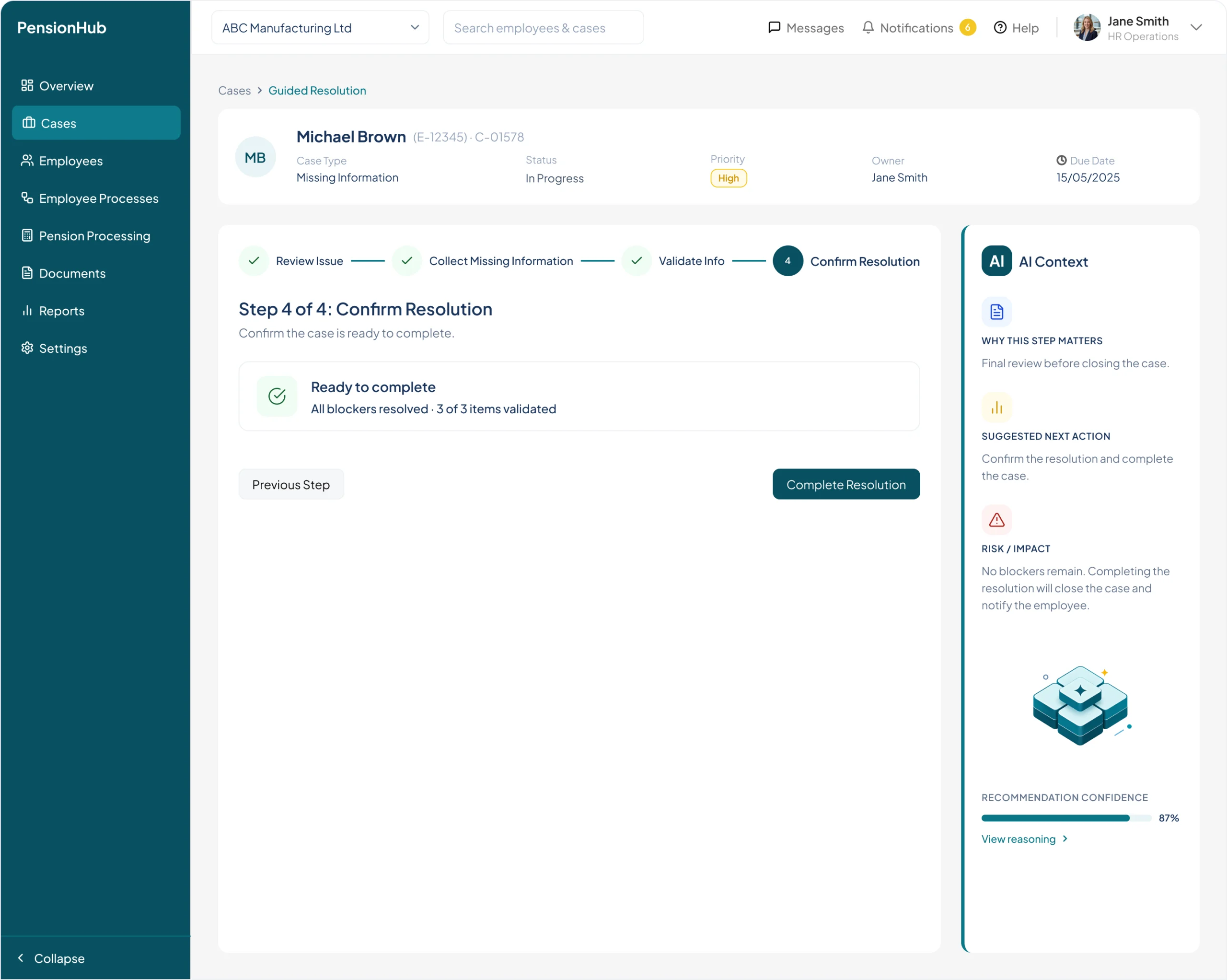
05 / COMPLETE

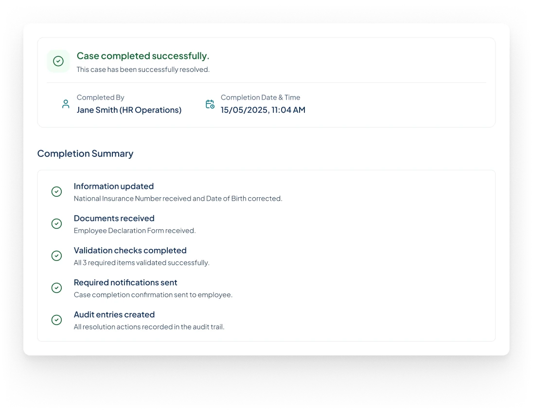
Completion

Confirm the outcome and review the audit trail.
Shortcut: Overview → Case Workspace
After completion: open the next case, or return to Cases

Returning to Cases preserves the list filters, saved view, sort and relevant AI context.

DECISIONS & ITERATIONS · 01

Clarity emerged when each screen had one job.

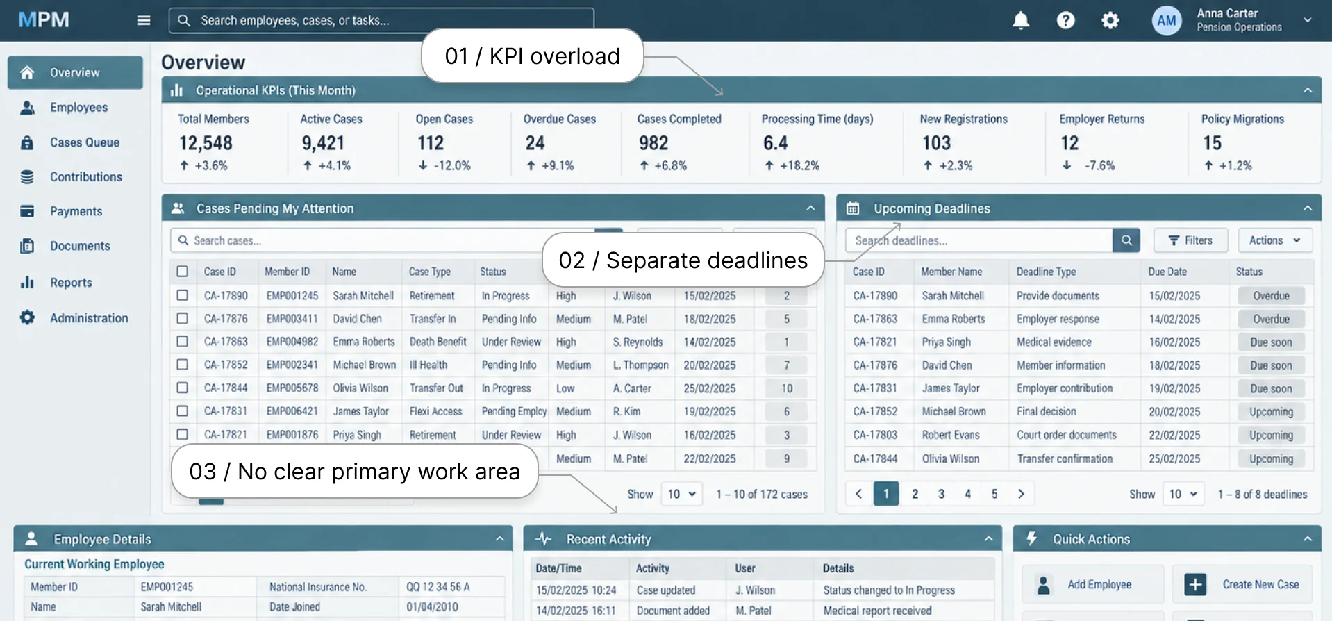
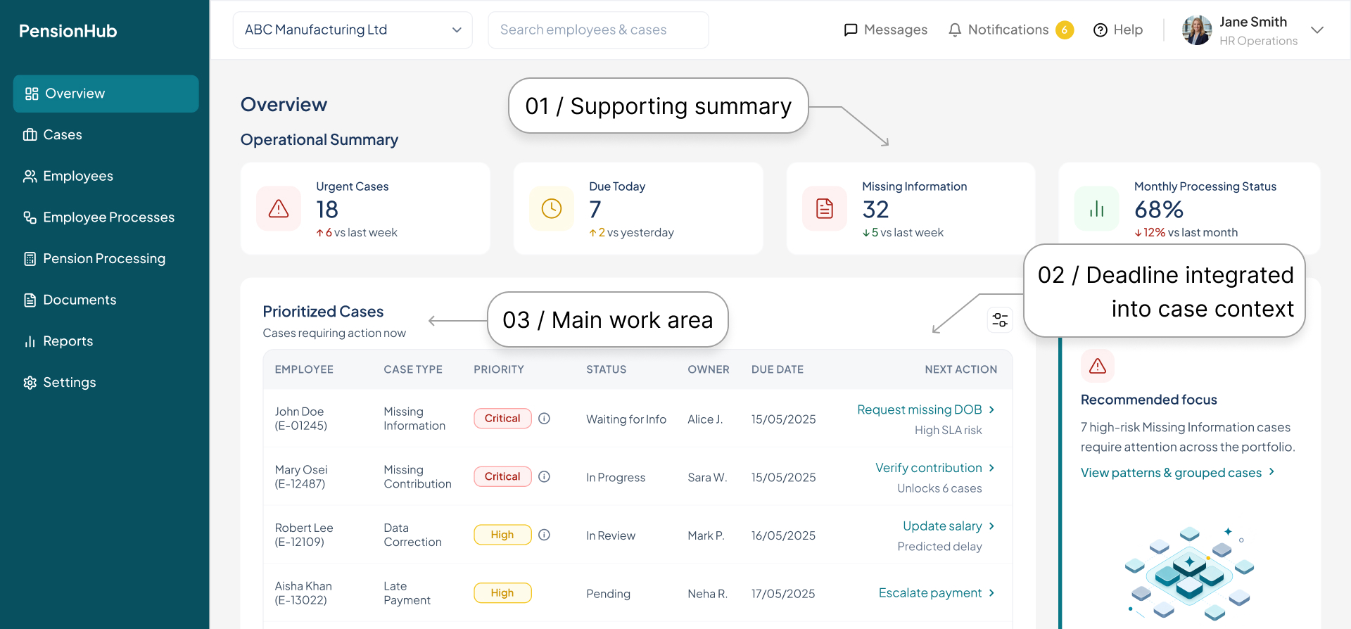
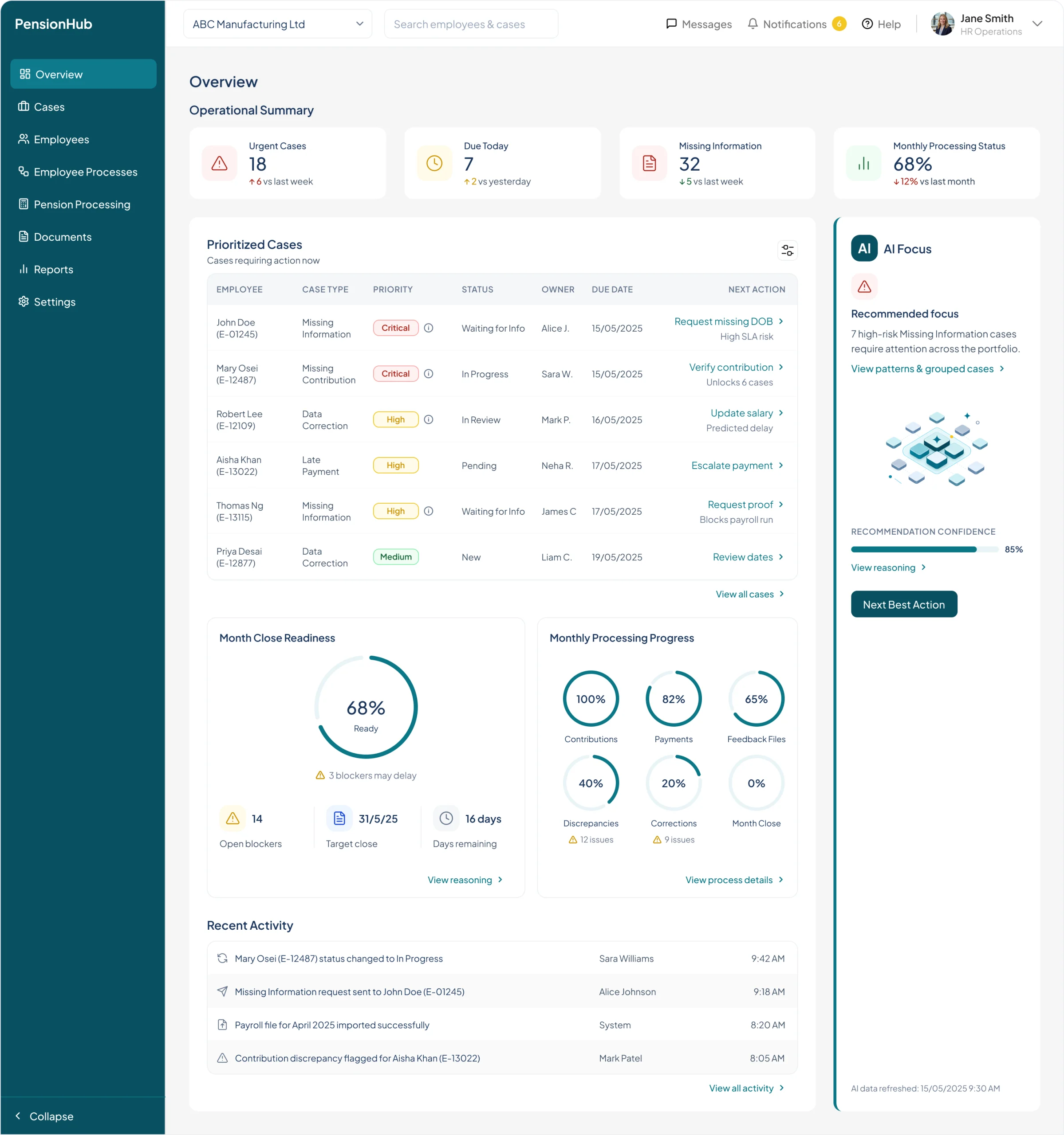
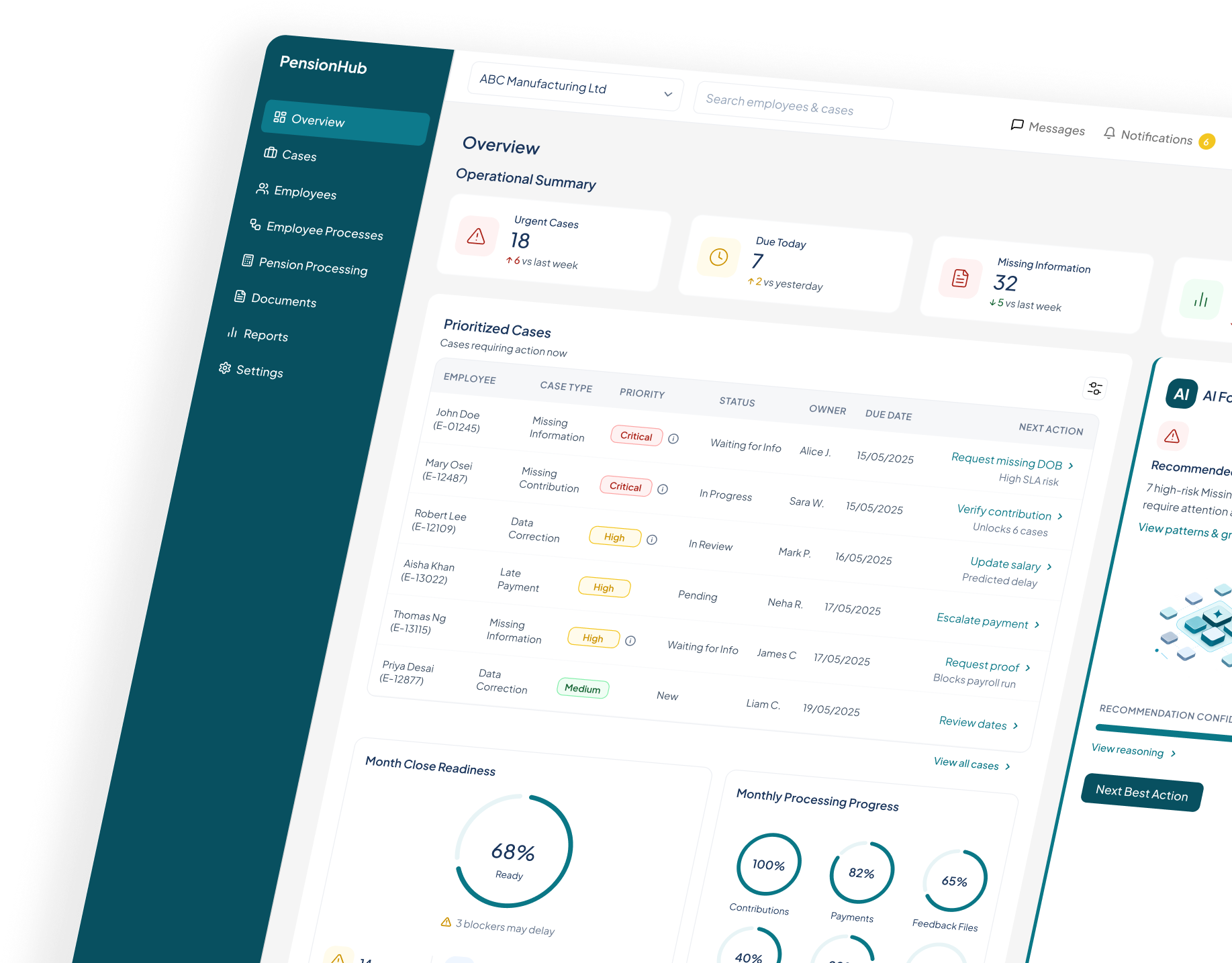
Overview: From competing information to clear priorities

Early iterations made KPIs, deadlines, cases and AI compete for attention. I made Prioritized Cases the main work area and removed the redundant Deadlines module.

Design decision: Separate monitoring from action, rather than giving every section equal weight.

BEFORE
KPIs, deadlines, and cases competed for attention.
AFTER
Prioritized Cases lead; KPIs and AI Focus support action.
DECISIONS & ITERATIONS · 02

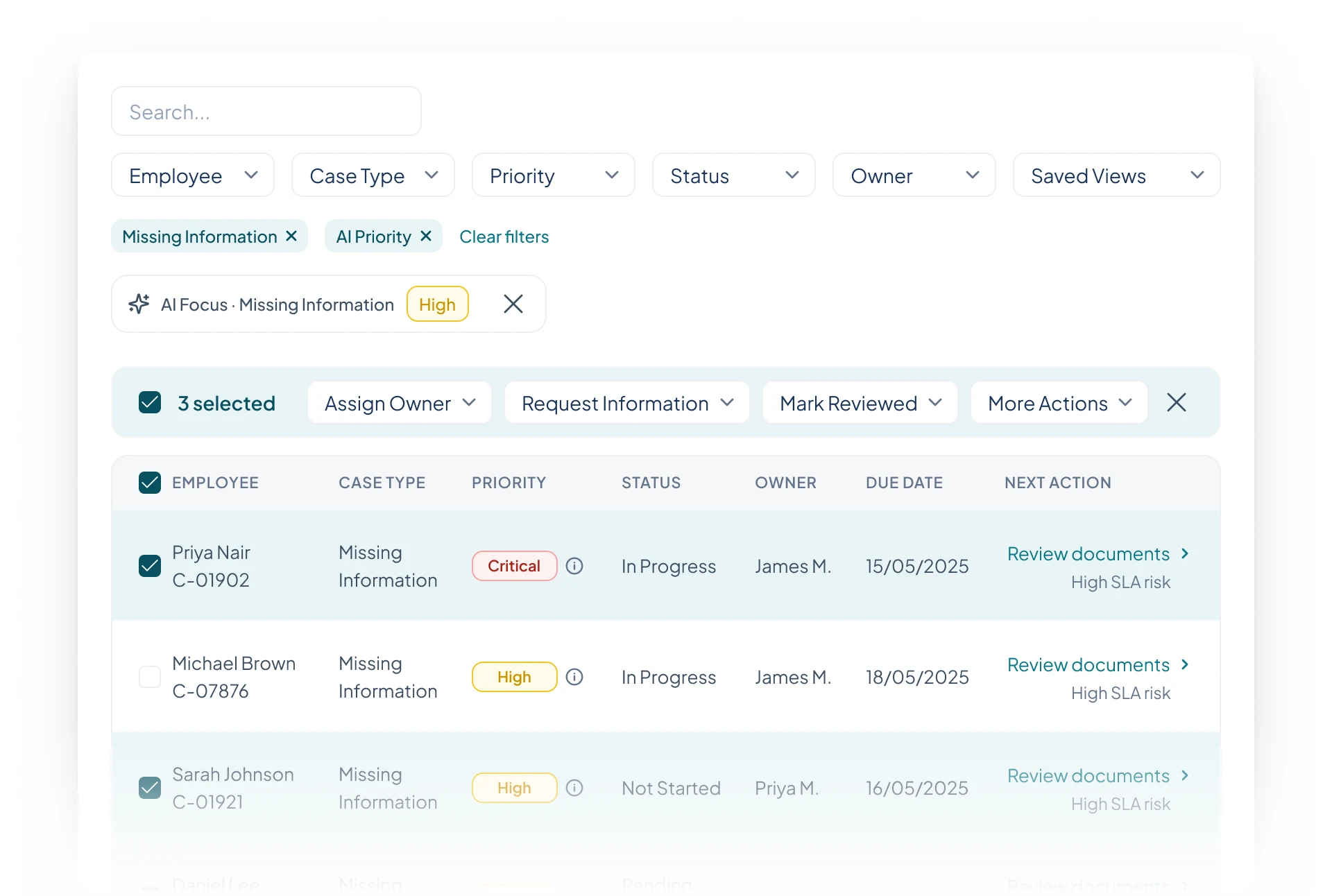
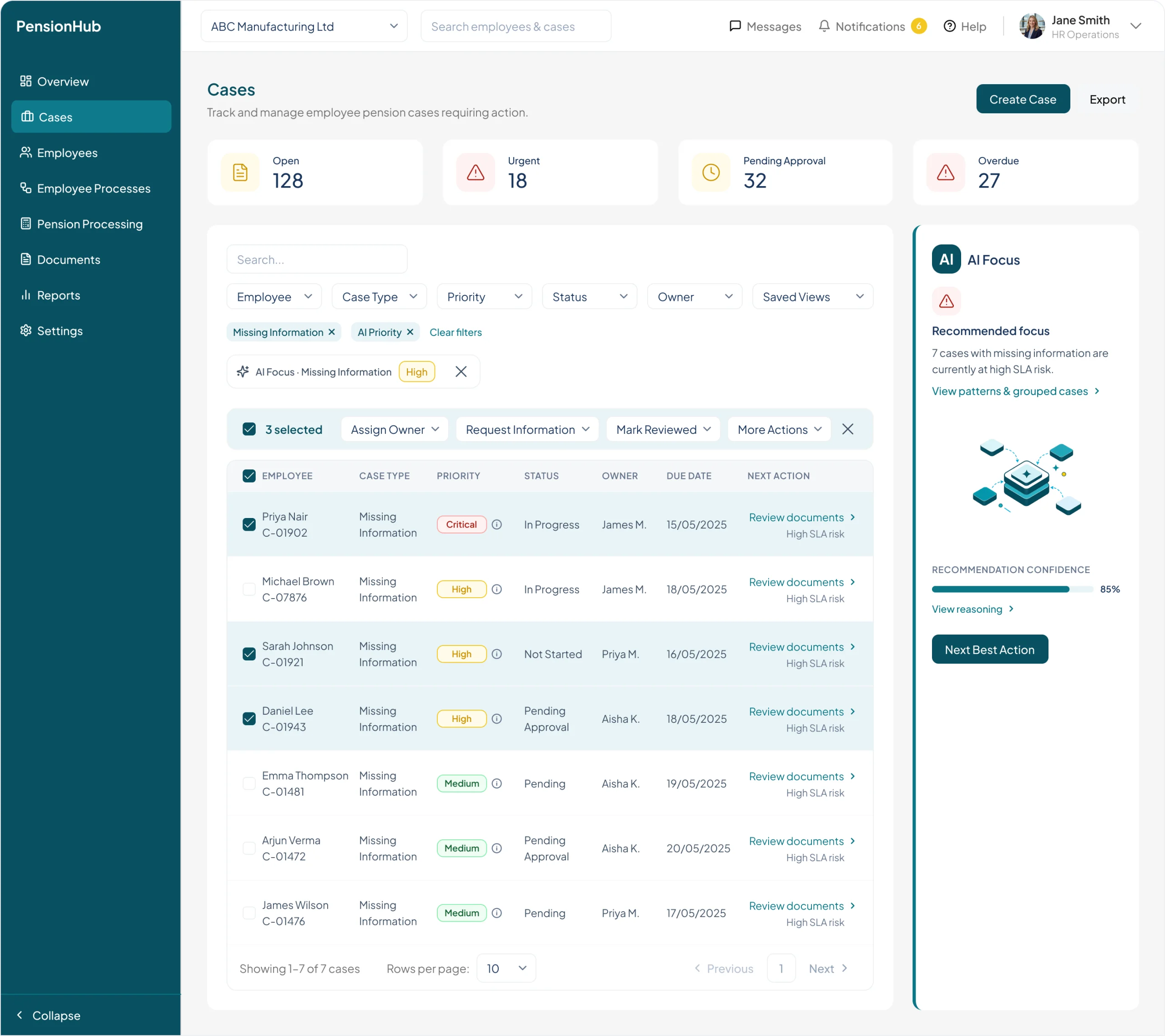
Cases became a work queue, not another dashboard.

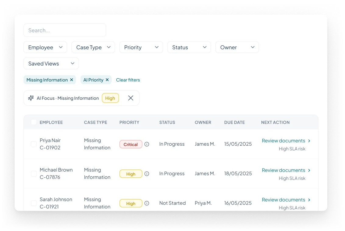
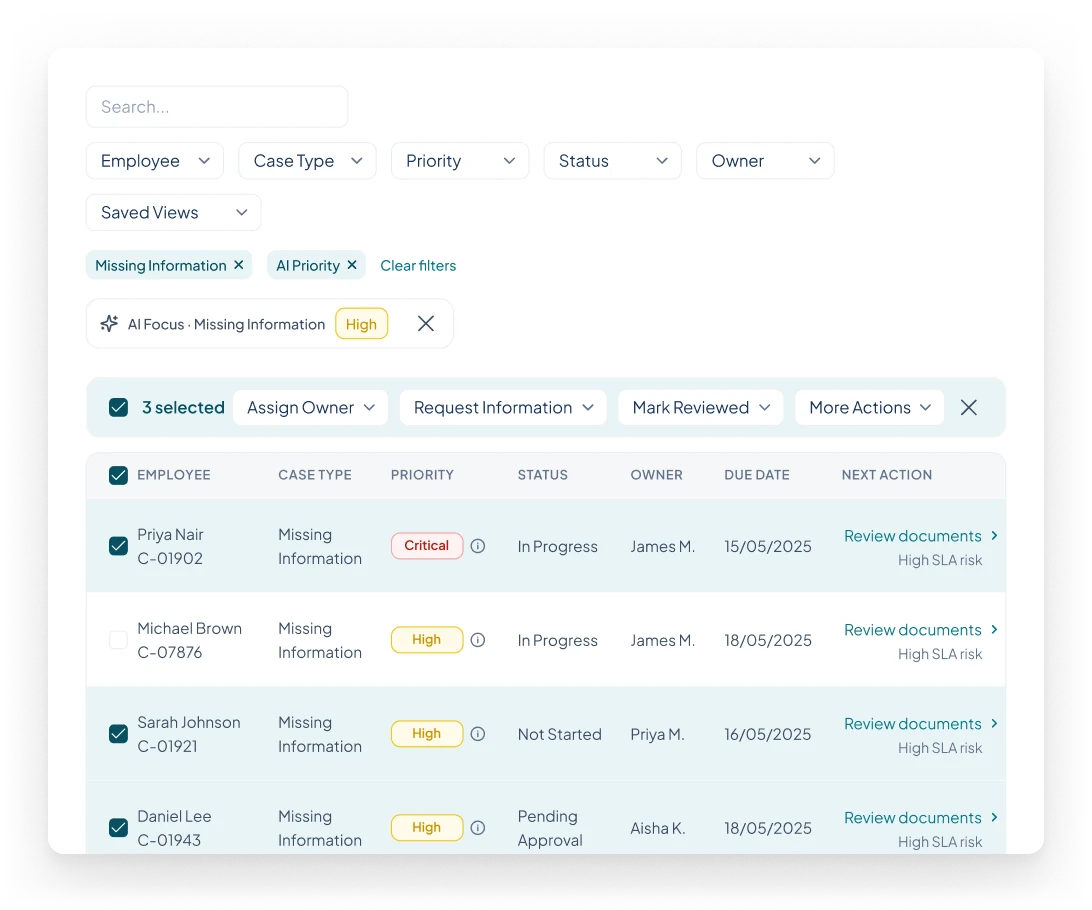
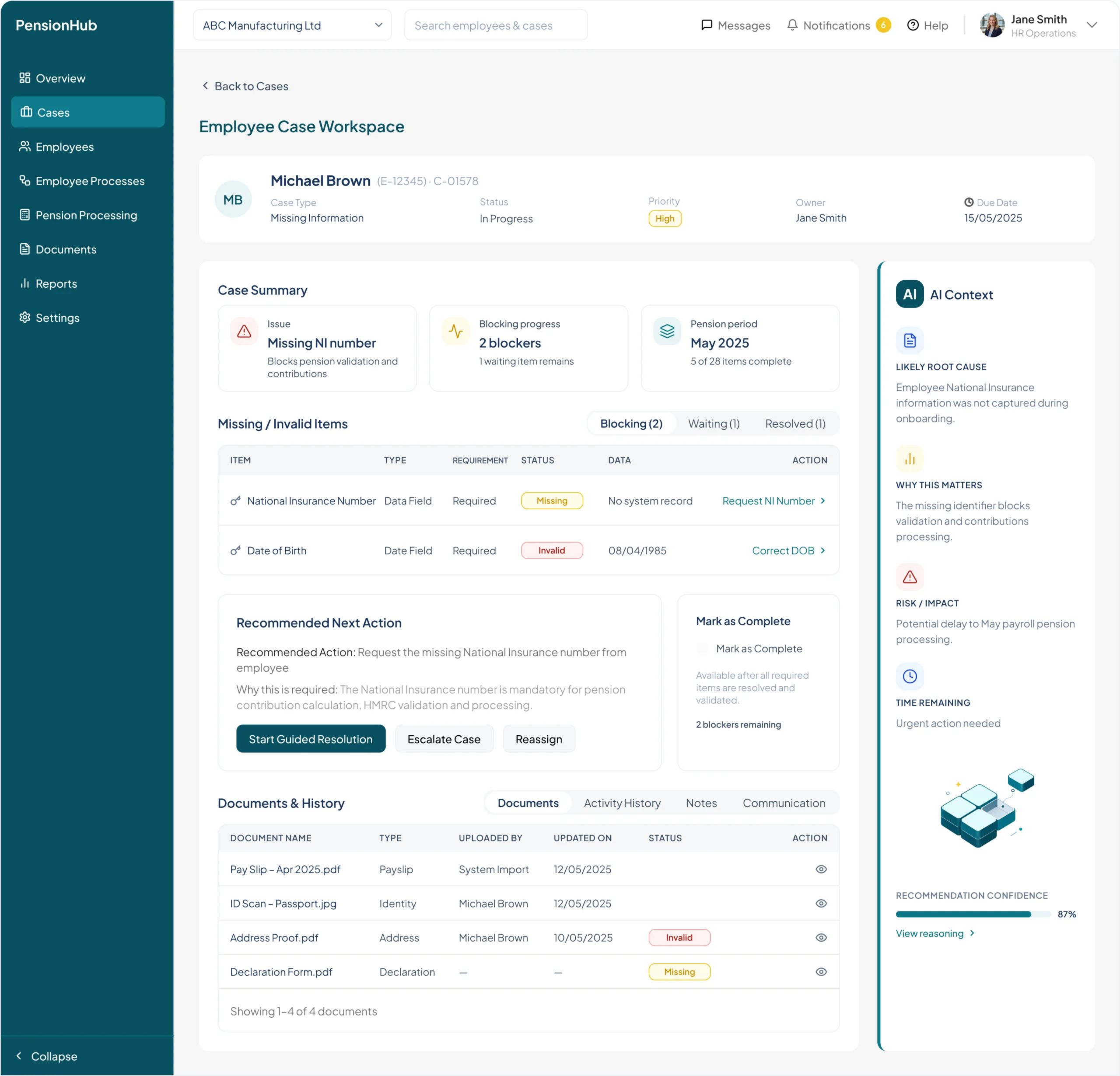
The Cases screen needed to support scanning, filtering, and managing multiple employee issues. I chose a table-first layout to make priorities, status, ownership, due dates, and next actions easy to compare. Bulk actions appear contextually, while filters and list state are preserved across navigation.

01
Contextual actions
Show bulk actions only when there is a valid selection.
02
Table-first hierarchy
Give operational cases the dominant work area.
01
02
03
04
03
Persistent context
Preserve filters, sort and saved views when returning.
04
Priority and risk
Differentiate case priority from SLA risk indicators.

Design decision: Prioritize operational efficiency over additional dashboard visualizations.

DECISIONS & ITERATIONS · 03

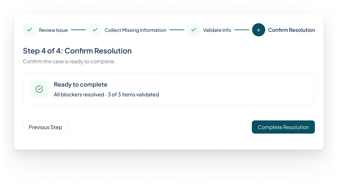
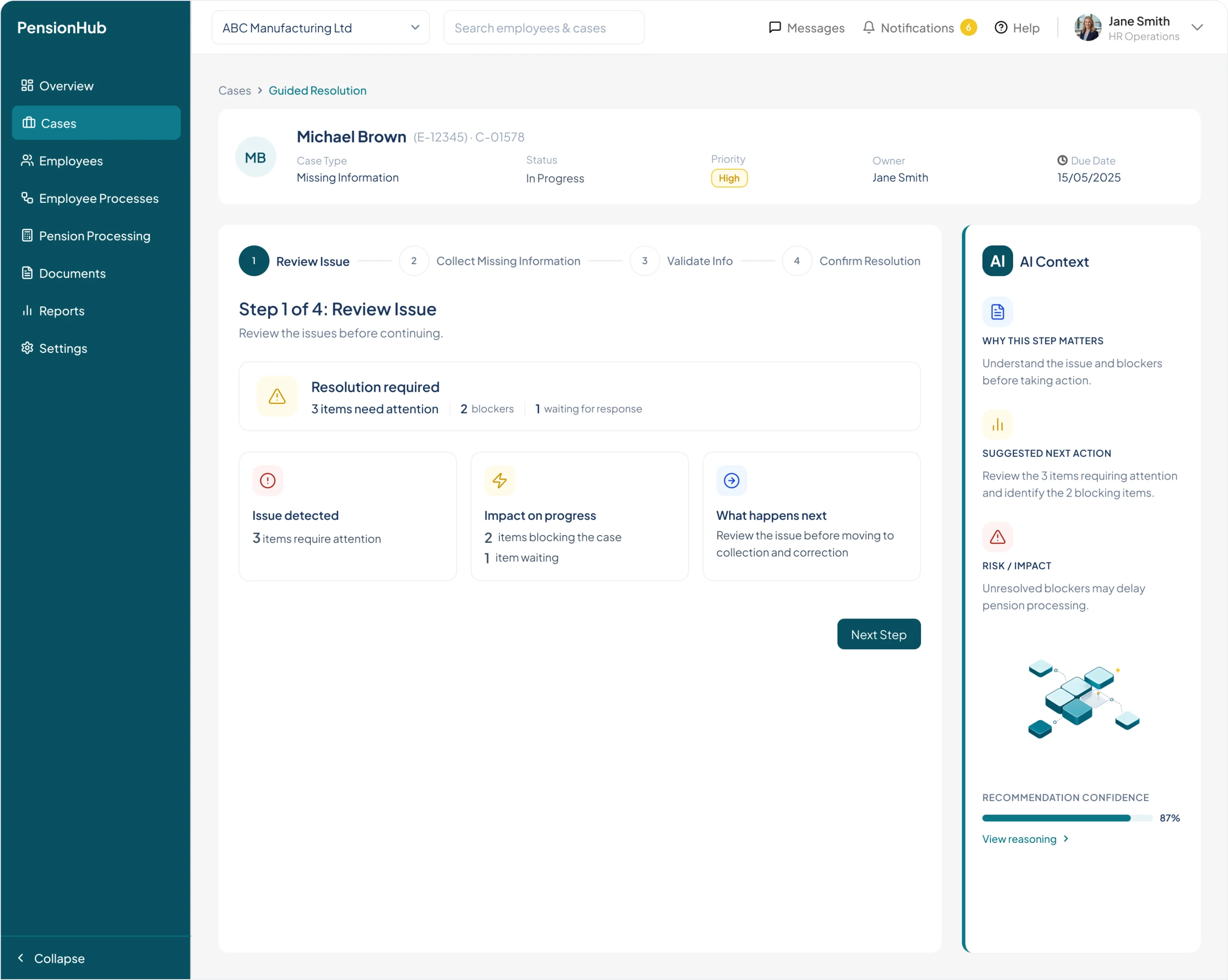
Guided Resolution: Progress Must Reflect Actual Readiness

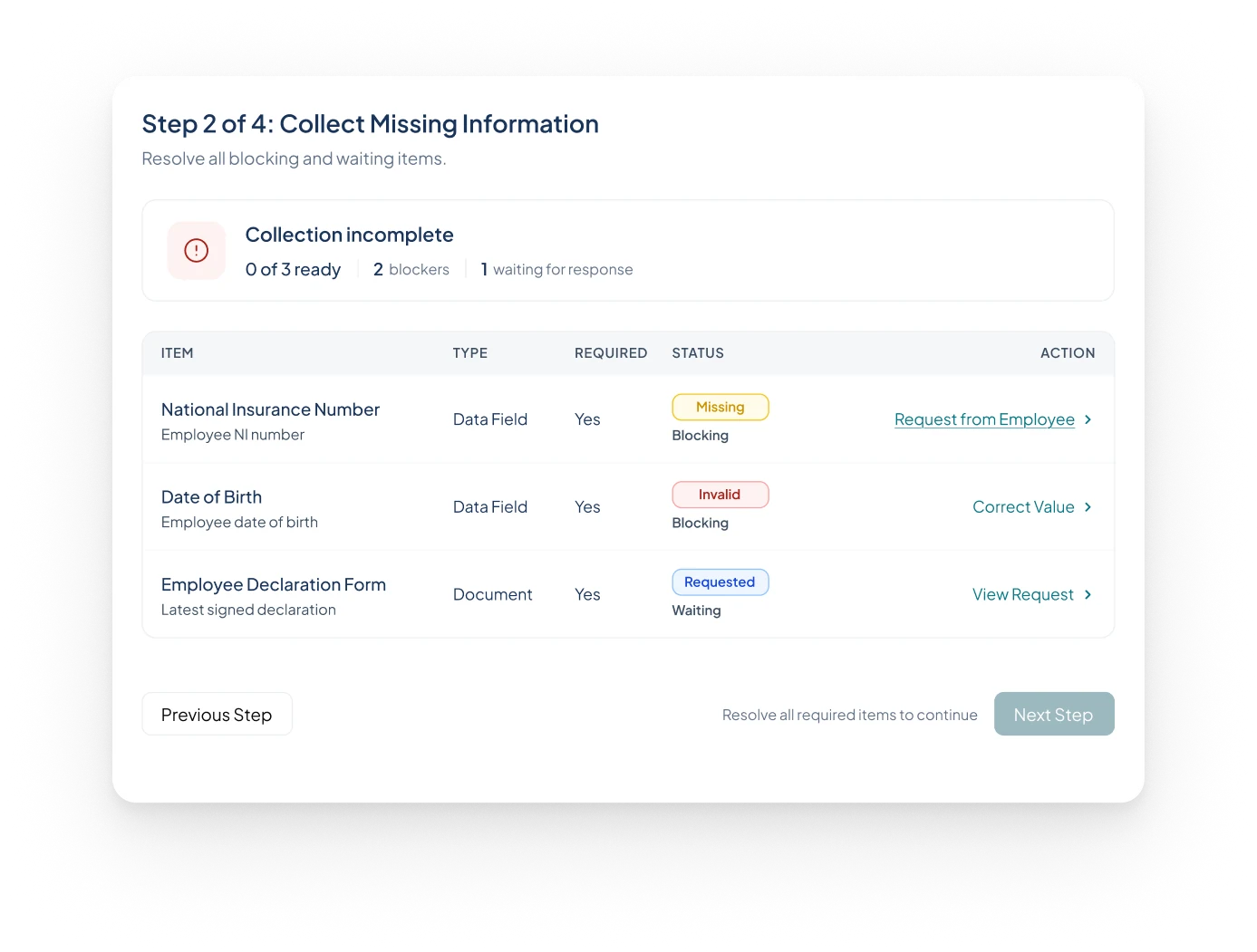
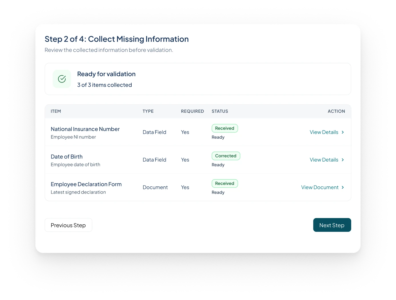
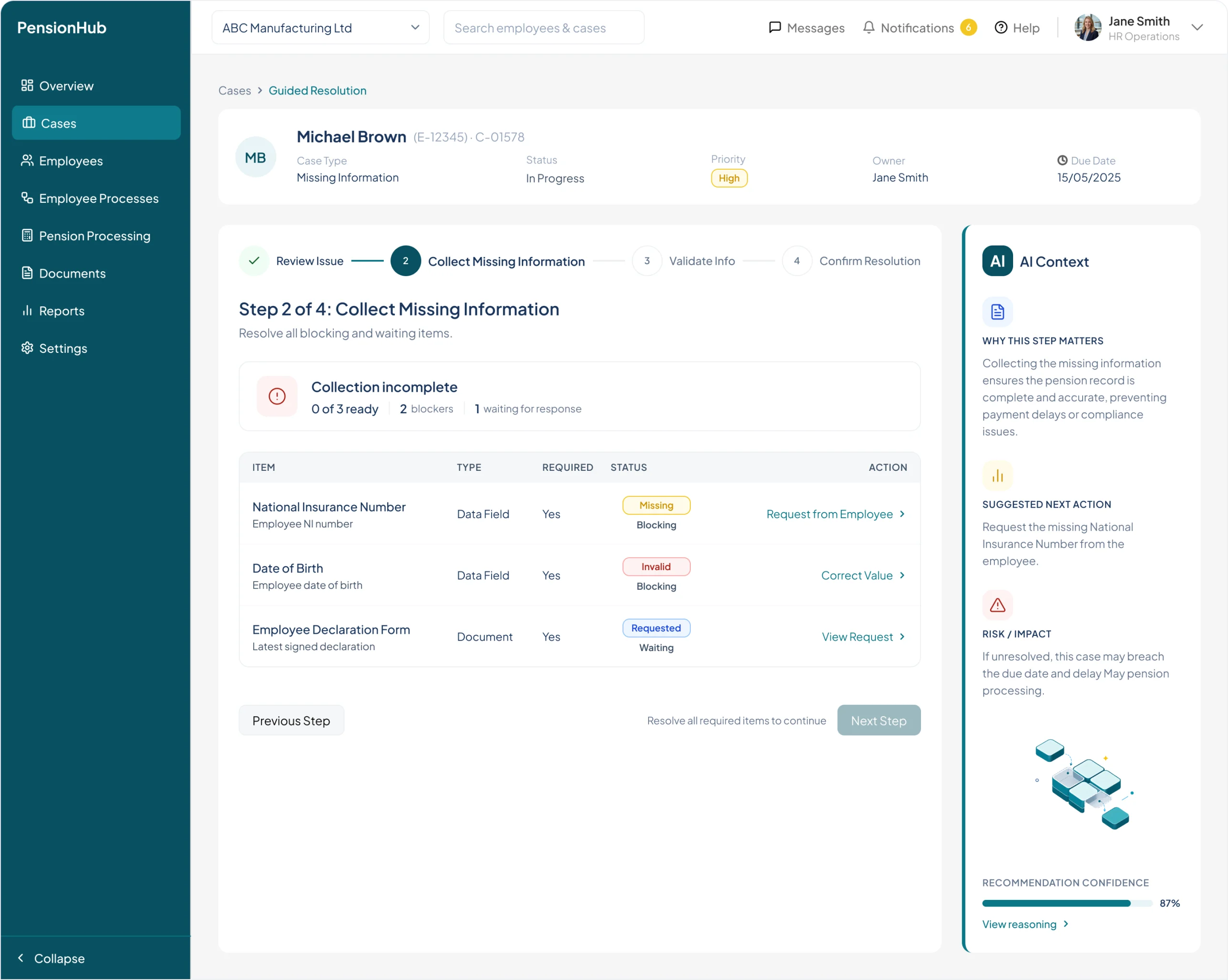
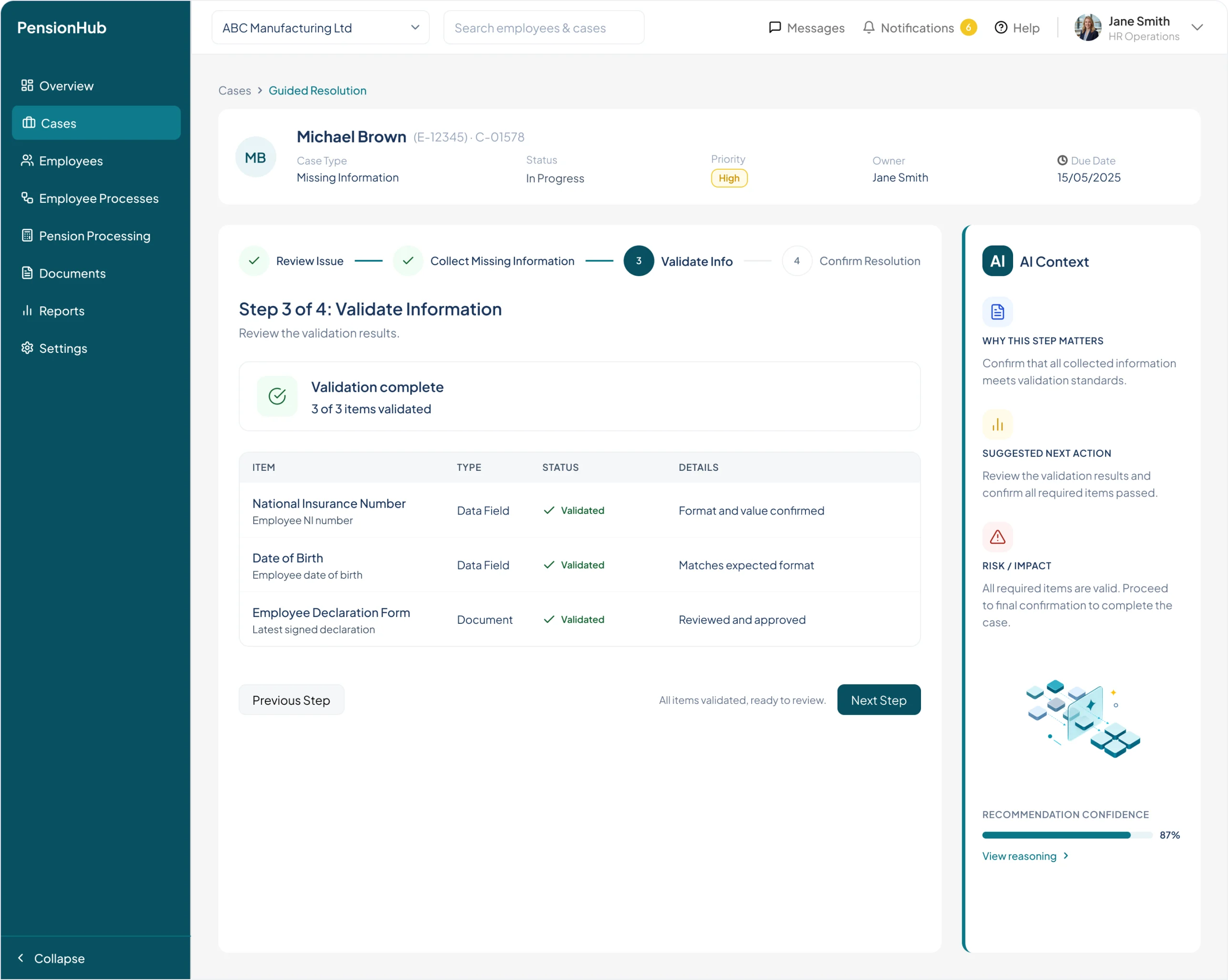
I structured resolution into four steps with explicit conditions for progressing. Step 2 has two separate states: unresolved blockers and information ready for validation.

COLLECT MISSING INFORMATION

Blockers still present

NEXT STEP DISABLED
01
02
03
04
COLLECT MISSING INFORMATION

Ready for validation

NEXT STEP ENABLED

Design decision: Make progress conditional on the actual case state, with explicit validation and final confirmation.

AI INTEGRATION STRATEGY

AI should support decisions,
not interrupt the workflow.

I explored three integration patterns. The hybrid direction kept the operational task primary, with AI available at decision points.

THE DESIGN TRADE-OFF
01

A separate
AI assistant

Dedicated space for deeper questions.
Requires users to leave the case workflow to seek help.
02

AI across
the interface

Signals visible in multiple locations.
Competes for attention and weakens the primary task hierarchy.
Isometric illustration of layered interface panels with embedded AI signals
03

Hybrid:
AI in context

Embedded cues + optional contextual explanation.
Preserves workflow continuity and human decisions.
SELECTED

Chosen model: embedded signals for priority, contextual reasoning when needed, and explicit human control.

HYBRID AI & HUMAN CONTROL

AI where it matters.
Human control where it counts.

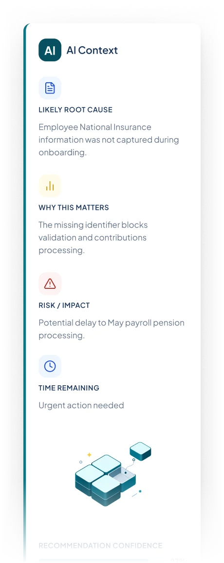
Embedded signals surface what matters. Contextual guidance explains the recommendation, while people retain control over validation and resolution.

01

Embedded signals

Risk, priority and next action
alongside the relevant case.
02

Contextual guidance

Reasoning, evidence and
confidence when needed.
03

Human decision

Validation, approvals and case closure stay with the user.

AI recommends. People validate and confirm resolution.

THE FINAL SOLUTION

From operational complexity
to a clear path forward.

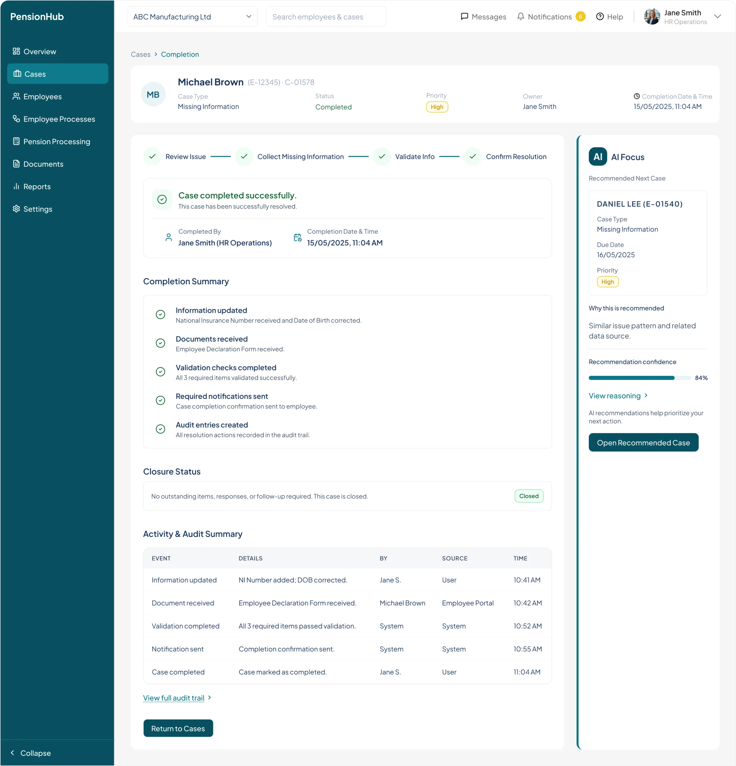
The proposed experience connects priority, employee context, guided action and completion in one continuous journey.

THE CONNECTED PRODUCT EXPERIENCE
01

See what needs attention

Cases
02

Understand the issue

Employee Case Workspace
03

Resolve and close

Guided Resolution + Completion

One journey: identify the case, understand the issue, take action and confirm resolution.

Overview, Cases &
Employee Case Workspace Screens

Guided Resolution Screens

Steps 1 & 2

Guided Resolution Screens

Steps 3 & 4

Completion Screen

OUTCOMES & IMPACT

Making complexity actionable.

The redesign resulted in a more cohesive case-driven product concept, connecting operational visibility with a structured path to resolution.

01

Clearer priorities

A focused work queue and a stronger operational hierarchy.
02

Connected resolution

Ownership, context, action, validation and completion in one journey.
03

Contextual AI

Relevant signals and explanations, with human oversight.
QUANTIFIED WORKFLOW IMPROVEMENTS
Actions
- 0

Shorter path to resolution

Transitions
- 0

Less screen navigation

Status Checks
- 0

Less manual verification

WHAT I LEARNED

Clarity doesn't mean less information.

Essential data at the right moment and depth.

Workflows matter as much as screens.

Preserve context and predictable state changes.

More AI isn't necessarily better AI.

Better decisions, without reduced user control.
FINAL REFLECTION
This project reinforced my approach to enterprise product design: understanding operational complexity, identifying the decisions that matter, and translating them into clear, connected, actionable experiences.
Enterprise clarity starts with the decisions that matter, and the next action people can take.
Design-level outcomes · Conceptual redesign · No measured production KPIs claimed

Thanks for reading 🙂